Organizing Block Code
How to organize your Edit function
As blocks get more complex the Edit function will get large and complex if it is written all in the same file. This can make it challenging to read and understand what the block is doing. Functions and state handlers for different UI elements and components get mixed together and the JSX that contains the actual markup of the block gets harder to find and understand.
This can make it harder for a designer who is not as familiar with React to make minor markup changes to the JSX.
For blocks that we build here at BU, we’d like to try to keep the edit function organized into separate files to isolate separate areas of functionality in the block. This should keep the Edit file smaller, easier to follow and more organized.
Code used in this example can be found at https://github.com/bu-ist/responsive-child-starter-3x-block-editor/tree/develop/src/blocks/example-editor-partials
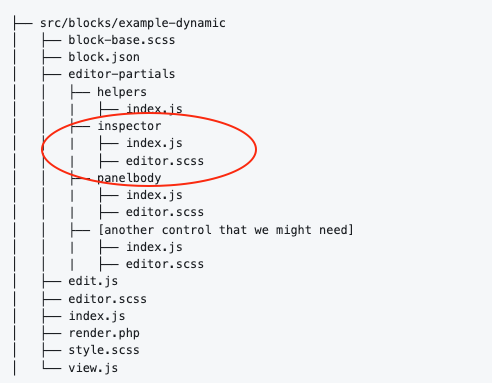
Editor-partials folder
The block architecture of an individual block should contain a folder named example-editor-partials. This folder will then house additional subfolders named after separate pieces of functionality.
Example: <EditorPartialsInspectorControls> component
The Inspector Controls component is the “sidebar” area of a block that is used to house a number of controls for various settings on the block. If you are adding any settings to the block you’ll need to import and render the <EditorPartialsInspectorControls> component inside your JSX.
However this frequently grows and gets to be larger than the rest of the block’s markup in the Edit function.
To keep things better organized we can move the InspectorControls component and all of the fields and controls that are inside it into an inspector sub folder:
First, add an index.js file in the ./inspector folder:
In this inspector partial we are exporting the EditorPartialsInspectorControls component which returns the core <EditorPartialsInspectorControls> component along with our onChange function.
Note: We have to give our component a distinct name so it doesn’t collide with the InspectorControls component name.
Also note: React requires that the first letter of components be capitalized. JSX will use this capitalization to tell the difference between an HTML tag and a component instance. If the first letter of a name is capitalized, then JSX knows it’s a component instance; if not, then it’s an HTML element.
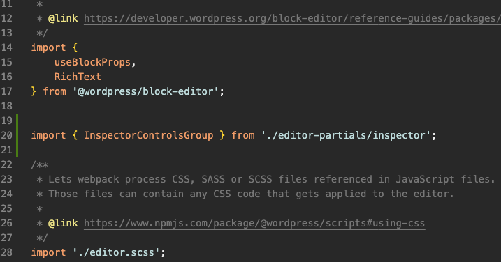
Importing your partial into Edit.js
To import your new inspector partial into edit.js you’ll have to do a few things.
Step 1: Import EditorPartialsInspectorControls from the local path to the editor partial file.
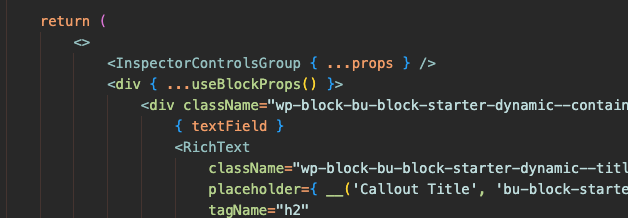
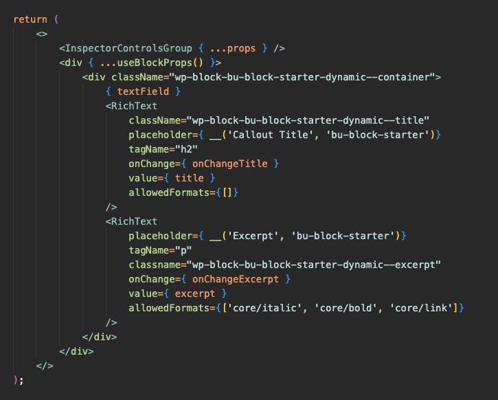
Step 2: In the return statement for the Edit function you’ll need to render the EditorPartialsInspectorControls component.
A couple things to note:
We want to be able to access attributes on the block as well as the setAttributes function that are available on this block’s props object. So to access this inside the InspectorControlsGroup component we need to pass the object to the component. Here we also are “spreading” the object so we can access the individual properties of the object:
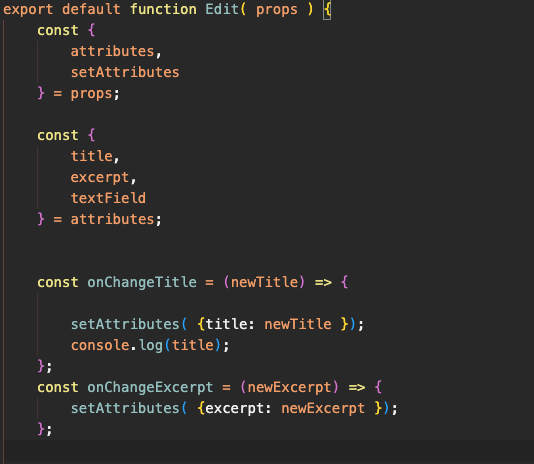
However, using the default block template you’ll probably have an issue with props being undefined.
This will happen if your block’s edit function is destructing properties of the props object directly in the parameters of the Edit function like so:
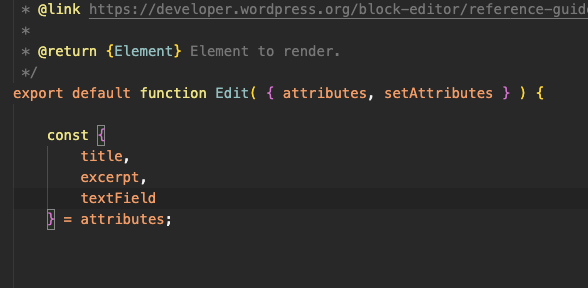
attributes and setAttributes are destructured from the props object.This technique is really a shortcut, and instead you can pass the props object and do the destructuring inside the Edit function like so:
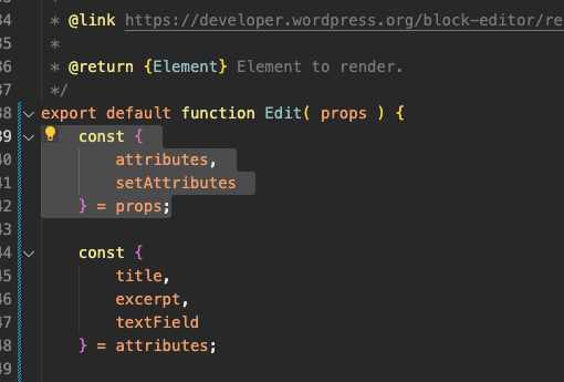
props is passed into the Edit function and the destructuring of attributes and setAttributes happens inside the function instead. This is functionally similar, but also keeps props available inside your Edit function.Lastly, inside your Inspector editor-partial file you’ll need to destructure the properties of the props object that you need. Most often this is attributes object and the setAttributes function. You can destructure these two from the props object right inside the parentheses of your InspectorControlGroup function:
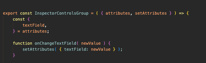
attributes and setAttributes is destructured from the parent block’s props object that you passed to the <EditorPartialsInspectorControls> component inside the Edit function. Then the
textField attribute is destructured from the attributes object so that it can be used to save the attributes to the block when the text field is modified in the sidebar. 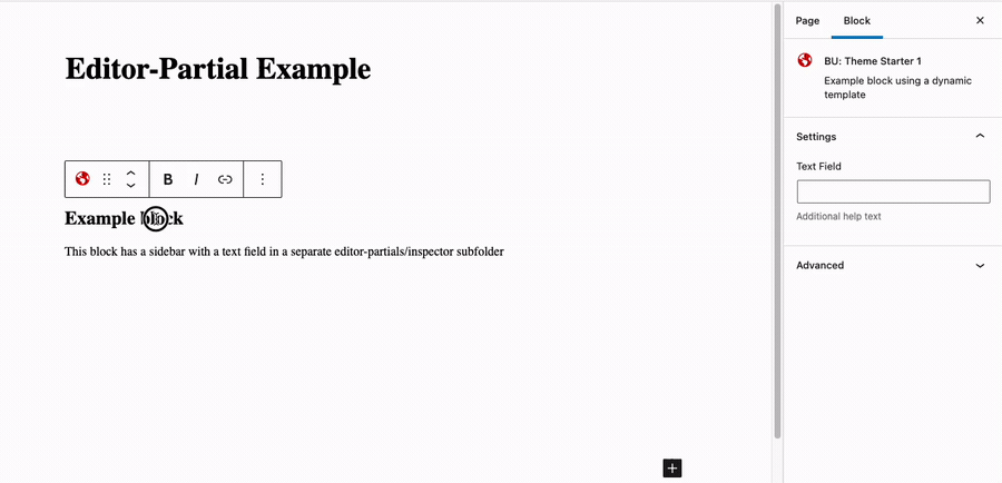
What should be in an Edit function?
This is going to depend on the block, but most important is the return statement with the markup for the block. This is usually going to be in JSX, which is a syntax extension for Javascript that lets you write a HTML-like markup inside a .js file.
You’ll probably also have some attributes destructured and some functions for handling onChange events for those components so you can save the data when the user modifies components in the block.
These are expected and acceptable to have in the Edit function. However, if you find that you are creating logically grouped chunks of functionality or UI components those would make sense to be moved into their own Editor-Partial file like the InspectorControls example above.
What these examples are will depend on your block, but here are a few that we’ve created in previous blocks that would be good candidates:
- A background component that opens in a modal and has multiple attributes to allow the user to set a background image or video, with an option for an overlay, color of the overlay, opacity of the overlay, etc. This component had 5-10 attributes just for the background settings and would make a lot of sense to move into it’s own file.
- A component to let the user set a looping video and some settings for controlling playback, etc. There might be attributes for the video URL, video source (Youtube, Vimeo, etc), aspect ratio, autoplay on/off, show/hide controls, etc.
- A component for controlling margin on all four sides of a block or element.
- A component for selecting posts and attaching them to the block.
How and when to move components and/or functions to the Editor-Partials sub folder
Think about what your custom component is going to do and how many attributes it has. Does it make sense as it’s own self-contained set of attributes and UI components? Are you going to need to build a custom UI, modal interface, etc to add it to the editor?
It would be best to start these more complex components as an Editor Partial, but sometimes at the start you don’t realize how large it will need to grow to so you always have the option of moving the code from Edit.js to an Editor-partial later in the process.
Our goal should be to keep the Editor function as clean and neat as possible. That doesn’t mean every attribute or component should be in it’s own partial, but try to find that balance between organization and the effort needed to convert components into partials.
What about shared components? How do they differ?
Another technique for reusing and organizing our block code is to create shared components. The components imported from WordPress core can be thought of as shared components. They are generic, usable for many different types of blocks but provide useful, common UI fields such as text, toggle switches, tabs, etc.
For our purposes, we will find it helpful to create shared components. These could be components shared within the same theme or plugin and used in multiple blocks or components published in the BU Block Components repository and imported via NPM.
Shared components differ from Editor-partial components however in their usage. Shared components need to be made more generic, abstracted, etc. They are used in 2 or more blocks for different purposes. These shared components will almost never save any data themselves. Instead they pass the data back to the block to be saved or used as needed because shared components should not be aware or able to access/save the actual block attributes.
Editor partials however are specific to the block and are able to access and save block attributes for that block. Editor partials are for organization within a block, while Shared components let us reuse components throughout a codebase or across multiple codebases.