Anatomy of a Block
A typical block is composed of several parts. Some are present on both the frontend and other just on the backend editor. Every part is used to compose the blocks contents as well as edit its appearance, functionality, and place relative to other blocks.
Block Toolbar
The block toolbar lives hovering above at the top a selected block (or as part of the toolbar just below the browser chrome if you’re in Top Bar view). It’s primarily houses controls used for formatting content; not unlike a wysiwyg toolbar. The control are dynamic and will vary depending on the block type. For example a Paragraph toolbar will have different options from an image block.
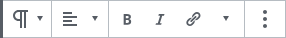
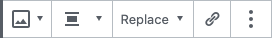
Additionally the toolbar allows you to transform a block into a similar block.
Block Content
The Block contents are the parts of the block that are user defined and what is ultimately render out to the frontend. It’s important to note that the contents of a block will vary drastically between the the backend and front end as well as if it is selected or not.
The type of contents allowed in a given block will vary drastically from block to block. some will allow for varying types of text, images, as well as other blocks, or could be limited to any of those mentioned.
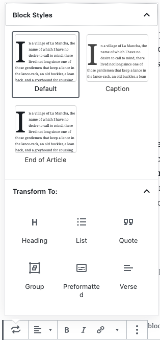
Inspector Panel ( sidebar)
The inspector panel houses additional blockwide settings oftentimes to cumbersome for the toolbar. For example block Styles, background and text color settings, and controls for adding additional classes are all settings found in this panel. There is no strict rule on where a setting or control should live but those found in the Inspector Panel are often times more secondary in nature.
States of a Block:
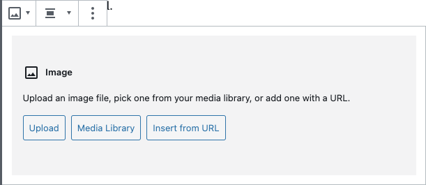
While the front and back end representations of a block will have a great degree of parody, there will be some difference. And how a block is represented and rendered on the backend can vary depending on its state. An image block for example has several differences present in the following three states.
Initial Setup State
The initial state of a block will often have form fields or prompts to guide you as to where content should go and what kind of content is expected to go in a given area. The image block for example has a standardized media insertion form that is presented despite selection state until an image is chosen and placed.
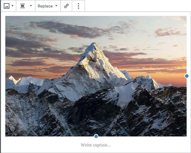
Selected
The Selected state is similar to the front end redner but will show any overlays used for customizing the content or unpopulated content areas. For example The image block will have sizing nodes along the edge of the image. And a caption area will be made visible with instructional text.
Unselected
The unselected state will hue closest to the frontend render, as you can see the image sizing controls are no longer visible and the unused caption area is hidden away.